Are you reading this on a Droid? On an iPhone? On some other diminutive device being introduced even as I write this? Knowing that you could be gives me pause. The smartphone has become a primary reading device.[1] So, unless you write nothing but lost-cat posters destined for telephone poles, or other print pieces that no one will ever upload to the Web, you have little choice but to join me in grappling with this question: what must writers do differently to accommodate the small screen?
The answer, I believe, is … nothing.
Of course, mobile technologies require different formatting. We’ve all struggled to read a page intended for the big screen, pinching it and spreading it and pushing it around on a screen the size of a business card. When we then discover a mobile version of the site, or when an app like Wikipanion reformats it like magic, we love the ease of reading the same content optimized for that itty-bitty screen. A lot can be done with presentation.[2]
But I’m not talking about presentation. I’m talking about text. I’m talking about your words, which—sooner or later, like it or not—will end up displayed in someone’s palm.
When it comes to text, today’s writers (which is to say, writers for the small screen) need to do the same things that writers have always done: cut, add, organize, and experiment. In this post, I talk about each in turn. But first, I want to dispel the myth that writers in the small-screen era should “keep it short.”
The Short-Sightedness of Short
Lots of people are talking about the need to write less—to keep it short—for mobile devices. Today’s readers, we’re told, suffer from “infobesity”; they “want less and less content.”[3] We supposedly live in an “era of brevity,” with our brains “rewired” in favor of short text.[4]
The problem is, short has no meaning. If I hand you a piece of string and say, “Make it short,” where do you cut? You can’t know. You have to understand who needs to do what with the string—and even then you don’t want to cut the string short. You want to cut it just right.
Think of writing as string cutting. Instead of aiming for short, aim for economical: the right length. Five words can be too many. Five thousand can be too few. The right length, even for the small screen, depends on “the context the reader brings,” as technical communicator Tom Johnson points out.[5]
We need to ask the same questions today that writers have always needed to ask: who will do what with the information? And how much do they already know? Until you do the work of answering these questions, you can’t make good decisions about what to include and what to leave out, and any effort to streamline your content “degenerates into making sentences shorter.”[6] So says JoAnn Hackos, who has spent decades teaching professionals about minimalist writing—writing that delivers no more (and no less) than what’s needed. I love her word degenerates. If your writing degenerates into a quest for shortness, you risk leaving readers puzzling over “cryptic terminology” and “unnecessary brevity.”[7]
Even that master of minimalism in fiction writing, Ernest Hemingway, famous for stories we call short, warns against seeking brevity for its own sake. His “iceberg theory” of writing makes clear that leaving things out requires discernment:
If a writer … knows enough about what he is writing about he may omit things that he knows…. The dignity of movement of an ice-berg is due to only one-eighth of it being above water. A writer who omits things because he does not know them only makes hollow places in his writing.[8]
In other words, when your inner guru (or your boss) chants, “Keep it short,” fire back (if only to yourself), “Make it as short as possible and as long as necessary.”
Tips for Cutting
When you cut, do so more aggressively and empathetically than ever. As Web-usability researcher Jakob Nielsen says, “Mobile use implies less patience for filler copy.”[9] Do you tolerate filler words in your writing? Tolerate no longer! Put on your drill-instructor hat, and pull up your text on a smartphone. Stare down every word. Does it contribute to the line-up? If not, out it goes.
Writer Maxwell Hoffmann attests to the value of reviewing his work on a smartphone. When he did this with a white paper that he had written several years before, he found parts of his text nearly unreadable. He reports, “My thumb nearly fell off scrolling through just three bulleted items…. I didn’t have the patience for my own thoughts presented in the confines of a handheld smartphone.”[10]
Instructive confession!
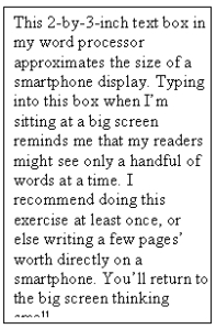
How do you recalibrate your definition of concise? Here’s a suggestion. Make yourself a small-screen template in any word processor. Or simply do some of your writing directly on a smartphone. That’ll get you thinking small.
 A small-screen template.
This exercise might sound like unnecessary bother, but it helps you tighten your writing—for screens of any size. When I asked Hoffmann what percentage of his edits for the small screen also improve the reading experience on the big screen, he said, “One hundred percent.”[11] Readers never needed all those words. In this sense, author Luke Wroblewski’s web-design mantra—”mobile first”—makes sense for writing too.[11a]
Ultimately, though, as Ann Rockley (often called the “mother of content management”) says, “It’s content first, NOT mobile first, eBook first, or any other first.”[11b] We write not for any one technology but for any technology. The universal mandate to “write tight” transcends technology—and change itself.
Tips for Adding
Let’s say that you now regularly cut every bit of text you can. Don’t stop there. Remember the complementary necessity: adding. Small screen, schmall screen. Go after thin copy. As author William Zinsser advised back when typewriters ruled, “strip your writing down” and then “build it back up.”[12]
Ask yourself, what else would readers appreciate? Your readers’ fingers are flicking for a reason. They’re not chasing after copy that’s skimpy. They want copy that answers their questions, copy that’s coherent, logical, useful, convincing, relevant, inspiring, edifying, amusing, fresh, clarifying, and sufficiently detailed.
What kind of details might you add? Choose from paragraph-development standbys like these:
- examples
- anecdotes
- definitions
- quotations
- metaphors
- instructions
- descriptions (sights, sounds, tastes, smells, sensations)
- answers to the W-H questions (who, what, when, where, why, whether, how, how much, how often, what else you got)
Some businesses find their fortunes by providing the right details. Kyle Wiens, founder of iFixit—a popular Web site that provides free repair manuals and advice forums—sums up the payoff this way: “Users will love people who teach them what they want to know.”[13] The iFixit Web site serves up detail-rich procedures that display beautifully on a screen of any size. The iFixit folks and their engaged customers add, add, add relevant information to this large Web site every day. As a result, they draw large, loyal audiences who order large quantities of parts and tools from them. As one indicator of this Web site’s success, iFixit has grown to become the second largest supplier of Apple parts after Apple itself.
Ours is an “era of brevity”? The success of Web sites like iFixit gives the lie to such claims.
 An excerpt from a detail-rich repair procedure as viewed in the iFixit app on a smartphone.
Cut and add go together like diet and exercise. Do both, as disciplined writers always have, and watch your flabby sentences and sagging paragraphs transform into specimens, hunks, Perfect 10s. Take the iFixit example. Deliver writing like that, and your true readers—the ones who are out there right now looking for exactly what you have to offer—won’t be able to pull their eyes away, no matter what size the screen.
Tips for Organizing
We writers for the wee screen also need to organize our material more carefully than ever, especially when it comes to what Nielsen calls “complicated content,” like “nightmarishly long” documents. Nielsen says that complicated content is “roughly twice as hard to understand” on a smartphone (“a peephole”) as on a desktop monitor. Nielsen notes that “a smaller screen hurts comprehension” because people can see less at a time, and because they have to move around the page more. He recommends “adding structure and navigation” to “create a tight information space.”[14]
In other words, don’t ramble. Organize your material. Ask what good writers have always asked:
- How many sections does this content logically divide into? (Whatever divisions smartphone users would appreciate, you can bet everyone else would too.)
- What section headings will readers find most helpful?
- Where should each section go?
New technologies don’t require new organizational skills; they increase the importance of using the old ones.
Tips for Experimenting
All kinds of issues come up as you look at your text on a tiny screen. You’ll have plenty of opportunity to experiment. If your documents, for example, require annotated illustrations (text callouts) or complex tables, consider converting them to a fixed-layout format, which can work surprisingly well on a small screen. Fixed-layout formats are evolving so fast that I hesitate to say much about them except that they fill a need. They enable the electronic publication of cookbooks, comic books, children’s books, technical manuals, or other books in which images and text (or text and text) must not reflow but stay connected to make sense.
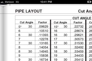
Bruce Ashton, a fellow attendee of the 2012 Intelligent Content Conference, showed me a fixed-layout technical manual on his iPhone. He explained his company’s luck: the toolbox-size handbooks they had been printing for 30 years had just the right proportions for today’s smartphones. Converting the handbooks to a fixed-layout format “is not a quick process but it works,” Ashton writes.[15] This format enables his company, IPT Publishing & Training Ltd., to deliver complex tables and annotated illustrations legibly on an iPhone.
 A zoomed-out two-page spread from a fixed-layout e-book. This example comes from a free excerpt of “IPT’s Pipe Trades Handbook” by Robert A. Lee, downloaded from the iBookstore. Used with permission.
 A zoomed-in look at the table text, as legible as you please.
As you encounter challenges of all kinds in writing for screens of all sizes, do what innovative writers have done since the first chisel was laid against the first stone tablet: let the spirit of experimentation lead you. Then share what you learn. We’ll create tomorrow’s options together.
Summary: the More Things Change…
When you write for smartphone screens—as we all do, whether we know it or not—you can’t go wrong if you rededicate yourself to the basics: cut, add, organize, and experiment. Don’t fall for the hollow advice to “keep it short.” Don’t think of mobile users as always in a hurry, and desktop users as tolerant of “happy talk.”[15] Don’t create separate mobile “lite” versions of your content. As interaction designer Josh Clark says, “Stripping out content from a mobile website is like … stripping out chapters from a paperback just because it’s smaller. We use our phones for everything now; there’s no such thing as ‘this is mobile content, and this is not.’”[17]
You don’t need a double standard to write for small screens. Good writing is good writing. Think small, yes. But don’t stop short just because the screen does.
r y cld jst dlt ll th vwls.[18]
—
This post expands on my post of a year ago: March 16, 2011.
[1] Conference presenter Maxwell Hoffmann tells technical writers, “The most common ‘sheet of paper’ for a first view of our ‘documentation’ will soon be that tiny screen held in your hand.” See “#ICC12: Resizing Content for the Small Screen: Considerations,” Adobe Tech Comm Suite Evangelist blog, February 24, 2012.
[2] Marcia Riefer Johnston, “Marketing Pros: Time to Think Small,” Elliott Design blog, April 29, 2011.
[3] Robert Desprez, “Ruthlessly Edit When Writing for Mobile,” Robert Desprez Communications blog, November 27, 2011.
[4] Tom Johnson, “Less Text, Please: Contemporary Reading Behaviors and Short Formats,” I’d Rather Be Writing blog, January 21, 2011.
[5] Tom Johnson, “Less Text, Please.”
[6] JoAnn T. Hackos, “What Makes Minimalism So Popular Today?” CIDM Center for Information-Development Management News, January 2008.
[7] JoAnn T. Hackos, “An Application of the Principles of Minimalism to the Design of Human-Computer Interfaces,” Common Ground (1999), 9:17–22. Reprinted by the Center for Information-Development Management (accessed March 1, 2012).
[8] Ernest Hemingway, Death in the Afternoon (New York: Scribner, 1932; First Scribner ebook edition 2002), 153–154.
[9] Jakob Nielsen, “Mobile Content: If in Doubt, Leave It Out,” Usable Information Technology Alertbox column, October 10, 2011.
[10] Maxwell Hoffmann, “#ICC12: Resizing Content for the Small Screen: Considerations.”
[11] Maxwell Hoffmann, Resizing Content for the Small Screen: Considerations for Single-Source Authoring for Tablet and Mobile Delivery, live presentation, February 24, 2012, #ICC12 Intelligent Content Conference in Palm Springs, California.
[11a] By “mobile first”—the title of his book—Wroblewski means, “Websites and applications should be designed and built for mobile first.” Luke Wroblewski, Mobile First (New York: A Book Apart, 2011), 1.
[11b] Rockley says this repeatedly. See Designing Adaptive Content for a Mobile World, an interview with Scott Abel and Val Swisher, May 11, 2012, recorded here: [URL pending]. See also Managing Enterprise Content: A Unified Content Strategy, 2nd ed. (Berkeley: New Riders, 2012), 136–139.
[12] William Zinsser, On Writing Well: An Informal Guide to Writing Nonfiction (New York: Harper Perennial, 1990), 20.
[13] Kyle Wiens, From Web to iPhone to Android to iPad: The iFixit.com Story, live presentation, February 24, 2012, #ICC12 Intelligent Content Conference in Palm Springs, California.
[14] Jakob Nielsen, “Mobile Content Is Twice as Difficult,” Usable Information Technology (useit.com) Alertbox column, February 28, 2011.
[15] Bruce Ashton, e-mail message to the author, March 1, 2012.
[16] Stephanie Rieger, “Mobile Users Don’t Do That,” Beyond the Mobile Web, February 10, 2012.
[17] Josh Clark, “Nielsen is wrong on mobile,” .net magazine blog, April 12, 2012.
[18] Or you could just delete all the vowels.


Pingback: Coming soon to the small screen « Word Power
I love this blog. Sometimes an idea takes hold, such as “I have to cut this explanation in half” until a well-reasoned argument comes along and we realize all we have to do is say what needs to be said. No more, no less. That’s always been what’s needed, but of course, that has always been the challenge.
Hi Marcia,
I appreciate your well written article. First, I was also under the impresson that we’ve to make it very short for the small screens. You’ve shaken me out of that idea. When I saw your examples, I recognized my mistake. Yes, we need to make it short as possble but have to keep it long as necessary too. Whatever we do with information, its clarity and completion have to be maintained.No questions on that.
A nice effort in the right direction!
I’m pleased to know that you found this post helpful. Thanks for your note.
I. Love. It. Enough said.
Awfully. Short. And. Sweet. Scott.
I wish I read this when I wrote my review of the gov.uk website. That site was certainly a strange animal–generous white space, vertical lists up the wazoo, responsive web design, state-of-the-art information architecture. But I can’t help but wonder if they’ve oversimplified their copy. (I can’t judge, since I don’t live in the UK.)
Oh, and those run-on sentences….